charming connections
When designing a home, it is important for the design of each room to flow nicely together! You should keep in mind how one space leads into another and try to keep the look you are trying to achieve consistent throughout your whole home. Of course we don’t mean that every room should have the same color palette, but they should coordinate well with each other and fell like one wholistic design! Keep reading to see some designs that have great transitions and figure out how you can achieve this look in your own home!
airy atmosphere
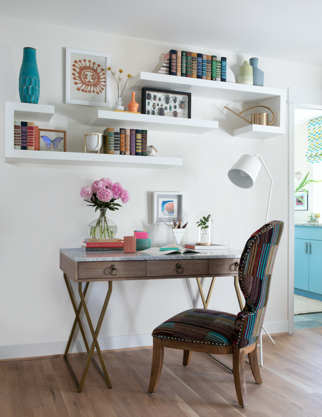
When designing any kind of space, it is important to keep in mind how the the overall design transitions from room to room! For example, in this guest suite that we designed, we wanted the design of connecting bathroom to coordinate with the design of the bedroom to create a nice flow. Designing rooms with the wholistic design in mind ensures that the final look is cohesive!
Design by: @emilyjunedesigns
Photo by: @kerrykirkphoto
bar beauty
This butler’s pantry has quite the bold color palette! This space is funky and fun and flows perfectly into the kitchen which has a more neutral overall look. The brass accents used within both spaces also help to further connect these spaces while keeping them separate!
Don’t be afraid to create different color schemes within different spaces, because there are many ways to still make the overall design look cohesive! All you have to do is include some similar elements like coordinating color palettes, metal finishes and stone selections. For example, keeping the hardware finishes consistent throughout your home can really create this cohesive look! In this design, the bar accessories are brass, along with the kitchen bar stools and pendant lights. Even the light switches are brass!
Design by: @house.of.drennan
Photo by: @_dpphoto_
perfect placement
This dining room design is so fun with the designer’s use of primary colors and bold art! The busy pattern on the area rug is balanced out by the solid dining chairs and table top, and the legs on the dining table add a fun little twist to the design.
The design of this space flows perfectly into the kitchen because of the coordinating color palettes! The blue countertops that we get a glimpse of coordinate so nicely with the pops of blue in the dining room. Even though we only get a small look into the kitchen design, it is apparent that the designer paid close attention to how these spaces flow together!
Design by: @jacques.grange
Photo by: @stephanjulliard
cosmic color
This designer was not at all afraid of using color or unexpected elements within this design! The use of yellow and purple hues among these two spaces is really what ties them together. Yellow and purple are complementary colors, so they naturally look great together! The yellow wallpaper within the first space along with the use of a yellow mirror as a focal point within the next room creates interest as well as a means for these two spaces to flow together. The unexpected elements come together to create an artistic atmosphere that work surprisingly well with one another in this design!
This design goes to show that creating a cohesive design can be done whether you are using a neutral color palette with classic elements, or a bold color palette with more whimsical elements! The sky is the limit!
Design by: @mishakahn
Photo by: @annieschlechter
finish fun
While the spaces we have looked at so far use color as the main component of connecting spaces, this design uses finishes and shape to create harmony! For example, the dining table legs feature the same marble finish as the fireplace in the living area, and the rounded dining chairs match the round cushions on the living room sofa. Even the wavy floor design ties in with the black and white painting hanging behind the sofa! Arched pillars are used to separate these open spaces, along with different flooring. This helps to keep these spaces separate without disrupting the flow of the design!
Design by: @gulmeninteriors


